Wednesday, September 29, 2010

The Greyhound Bus

I am still researching Raymond Loewy's Career. This is the Greyhound Bus designed by him in 1946. This creation changed the mass transportation in that period. 

 Source: Loewy, R. 1979. Industrial Design. Woodstock, NY: The Overlook Press.

Wednesday, September 22, 2010

Coca-Cola, by Raymond Loewy

Source: Trétriack, P. 1999. Raymond Loewy and streamlined design.  New York: Universe Publishing.
The Coca-Cola dispenser, before and after 1947, when it was redesigned by Raymond Loewy. He was asked to rethink the design of dispensers for bars and delivery trucks.

Wednesday, September 15, 2010

The F! Poster


Source: Riggs, T. 2009. Typeface: Classic typography for contemporary design. New York: Princeton Architectural Press.

I am still researching fonts to help me in the Webdesign class I am taking here at Parkland and also in the Graphic Design class. This poster was made by de designer Michael Braley using Helvetica and Sabon. Sabon is an Old Style typeface descended from the forms originated by the designer Claude Garamond.

Wednesday, September 8, 2010

Library Research - Typography 2

Source: HELLER, S. and ANDERSON, G. 2010. New Ornamental Type: Decorative Lettering in the Digital Age. New York: Thames & Hudson. 

In the same book of The Puty Tree (read my Typography 1 Post), I found this picture. Made with roman letters, its name is The Slip. It was made by Nate Duval using hand lettering as primary font. According to the designer, the picture reflects the layering and Cubist mannerisms of the 1920s and 1930s. 
 
With all the letters and colors, I think that the picture is aggressive, loud, witty and bold. It is also trendy and energetic.  

Library Research - Typography 1

Source: HELLER, S. and ANDERSON, G. 2010. New Ornamental Type: Decorative Lettering in the Digital Age. New York: Thames & Hudson. 

As a journalist, I am used to work with letters. The Graphic Planning course that I took during my undergrad had a lot of typography research. Nowadays, I am back to school and I've decided to start studying typography again. This is my first day of research at the Library and I found very interesting books about this field. 

I was impressed with the creativity of the work they have in the book New Ornamental Type - Decorative Lettering in the Digital Age. This picture is called The Puti Tree. It was made by the Design Firm Khaki Creative & Design under the supervision of the art director Nod Young.

According to him, the picture was created as an interpretation of two poems quoted form the original Zen classic, The Plataform Sutra of the Sixth Patriarch, which dates almost 1,500 years. The picture was not based in any primary font and is Young's interpretation of design and Buddhism, as he explained in the book.

Although it has some cold colors, the picture is not cold or sad at all. It is energetic, innovative, playful and spontaneous.     

Wednesday, September 1, 2010

A second first time

I used Photoshop long time ago during my BA in Communications in Brasilia. Many years and many program versions after that, I had a chance to use Photoshop again this week at Parkland. I followed the instructions for one exercise and spent three hours trying to color this hibiscus flower. I can assure you that it is easier to write than to edit photos in the newspaper. Here is the flower I worked on. Don't get too scared. I tried my very best.


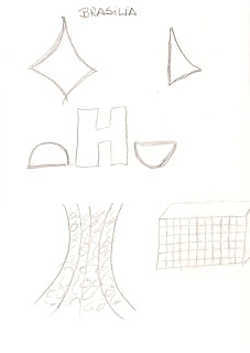
My first sketch

This was the first sketch I made in my life (and in this course). I tried to show a little bit of Brasilia's Architecture.